Project
Pink Pen PublishingClient
Uitgeverij Het MoetType
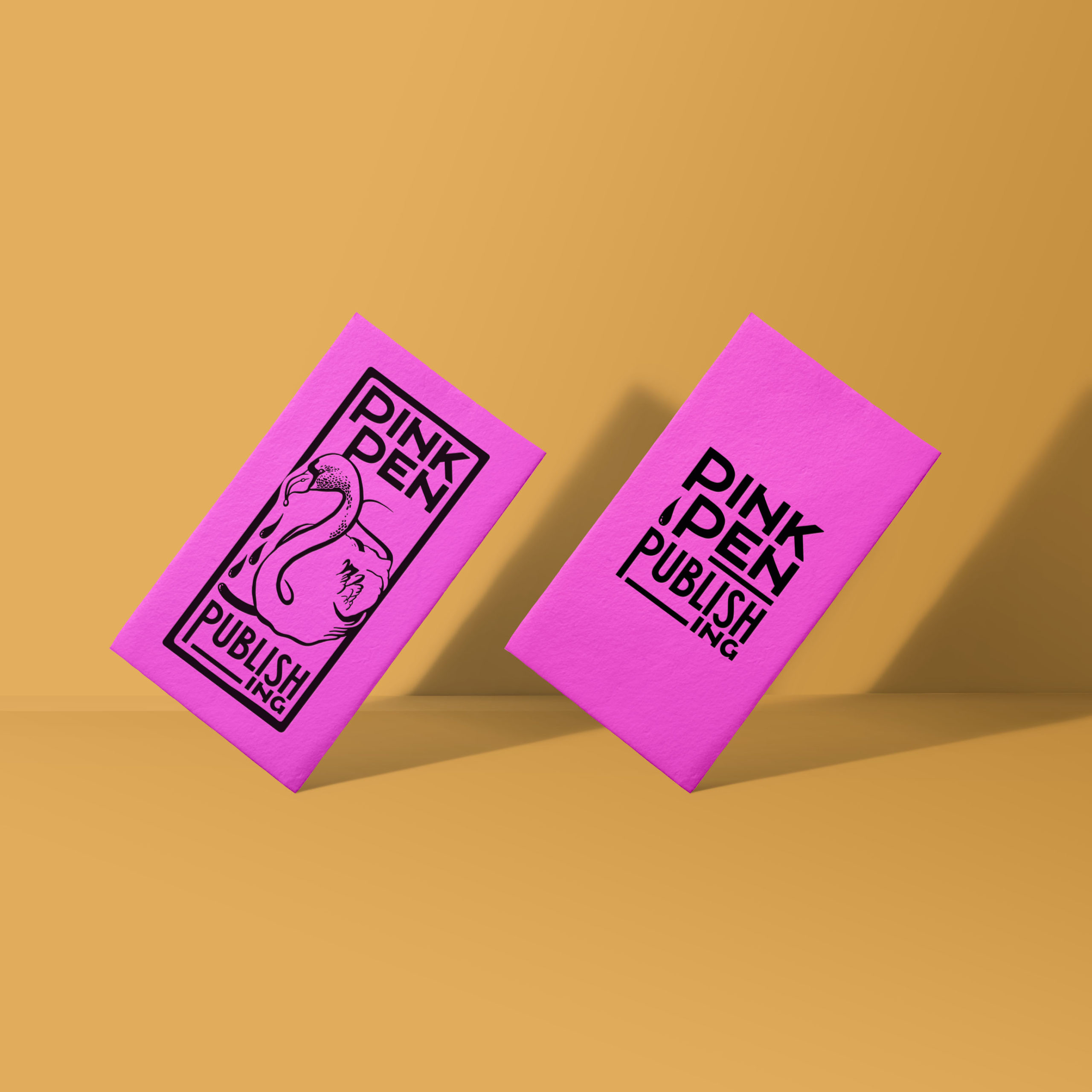
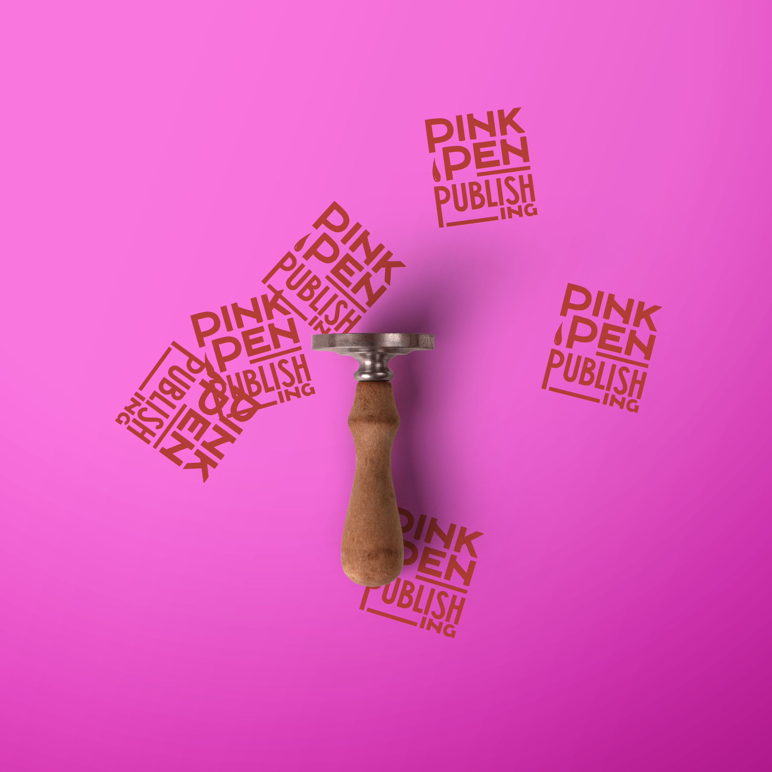
Logo DesignThe dutch book publisher called ‘Het Moet’ opened a new office in London with the name ‘Pink Pen Publishing’. The logo consists of a Pink Pen (bird) that draws an ink line on it’s way through the water. I created the logo and typeface with a vintage, female and anarchistic character as fits the clients image. Importantly I needed to keep the size and usability of the logo in mind because it is placed on the back of all published books. Next to this usage the logo is used as stamp, on business cards, in books, website etc.