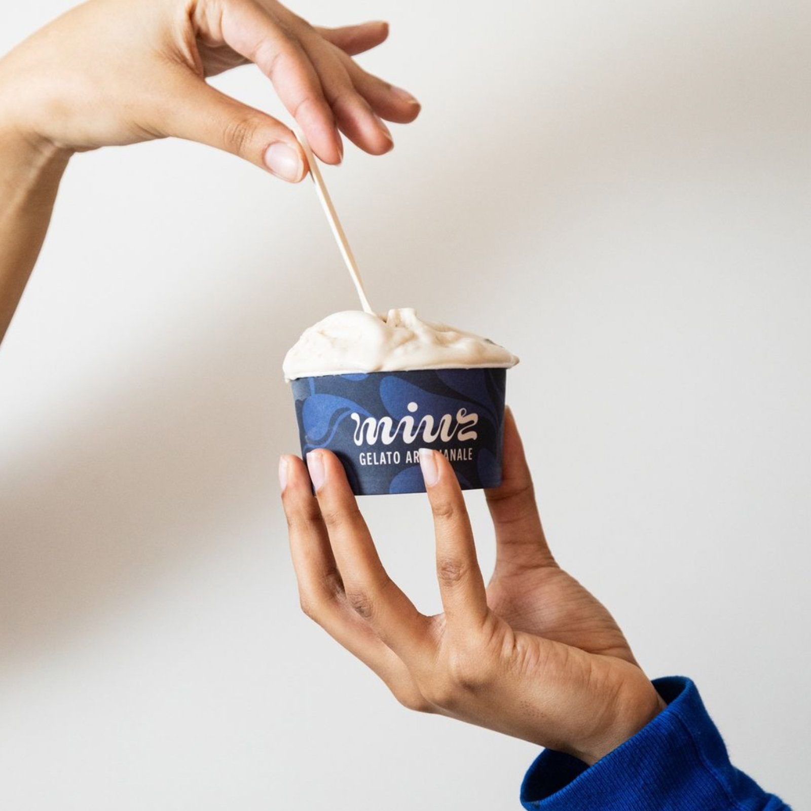
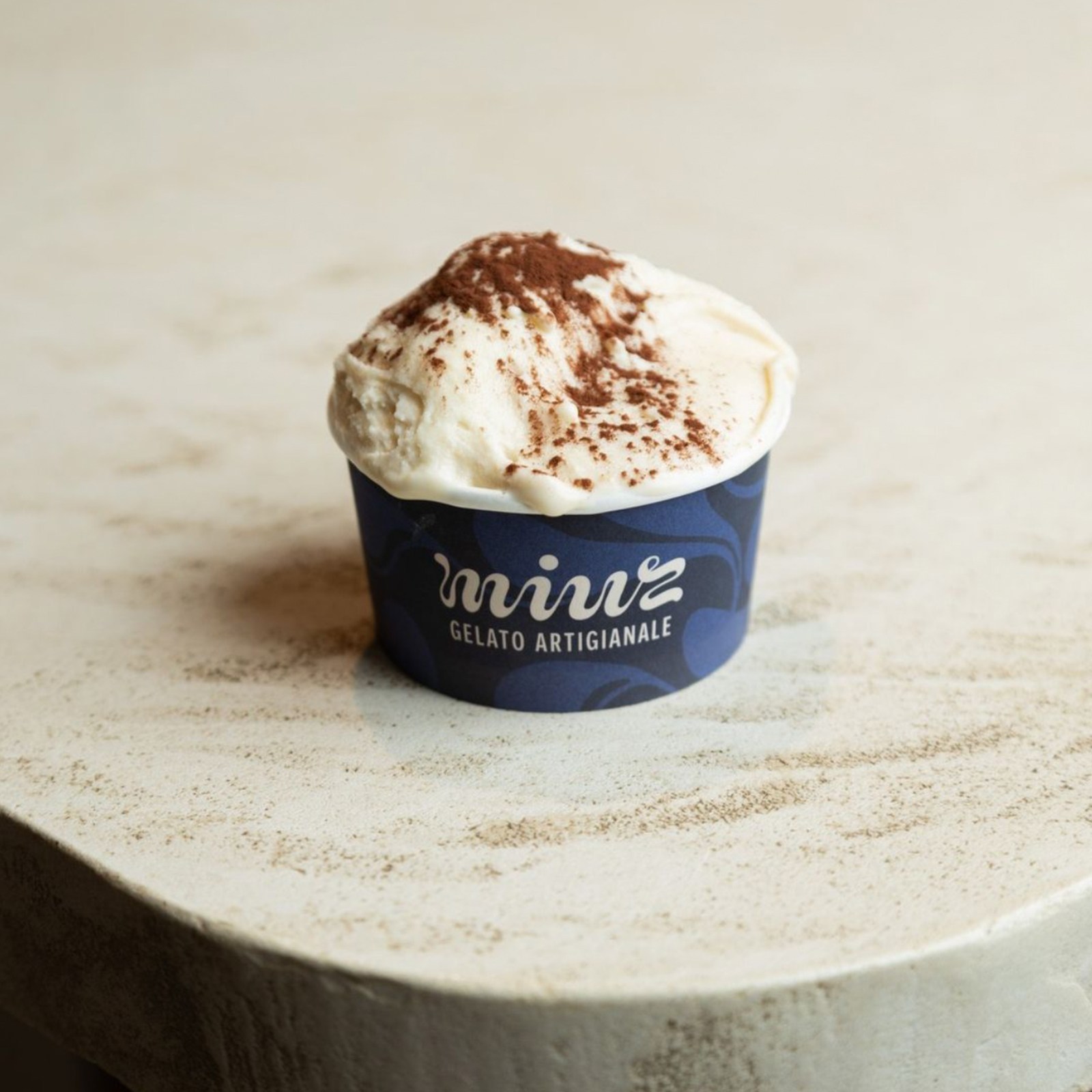
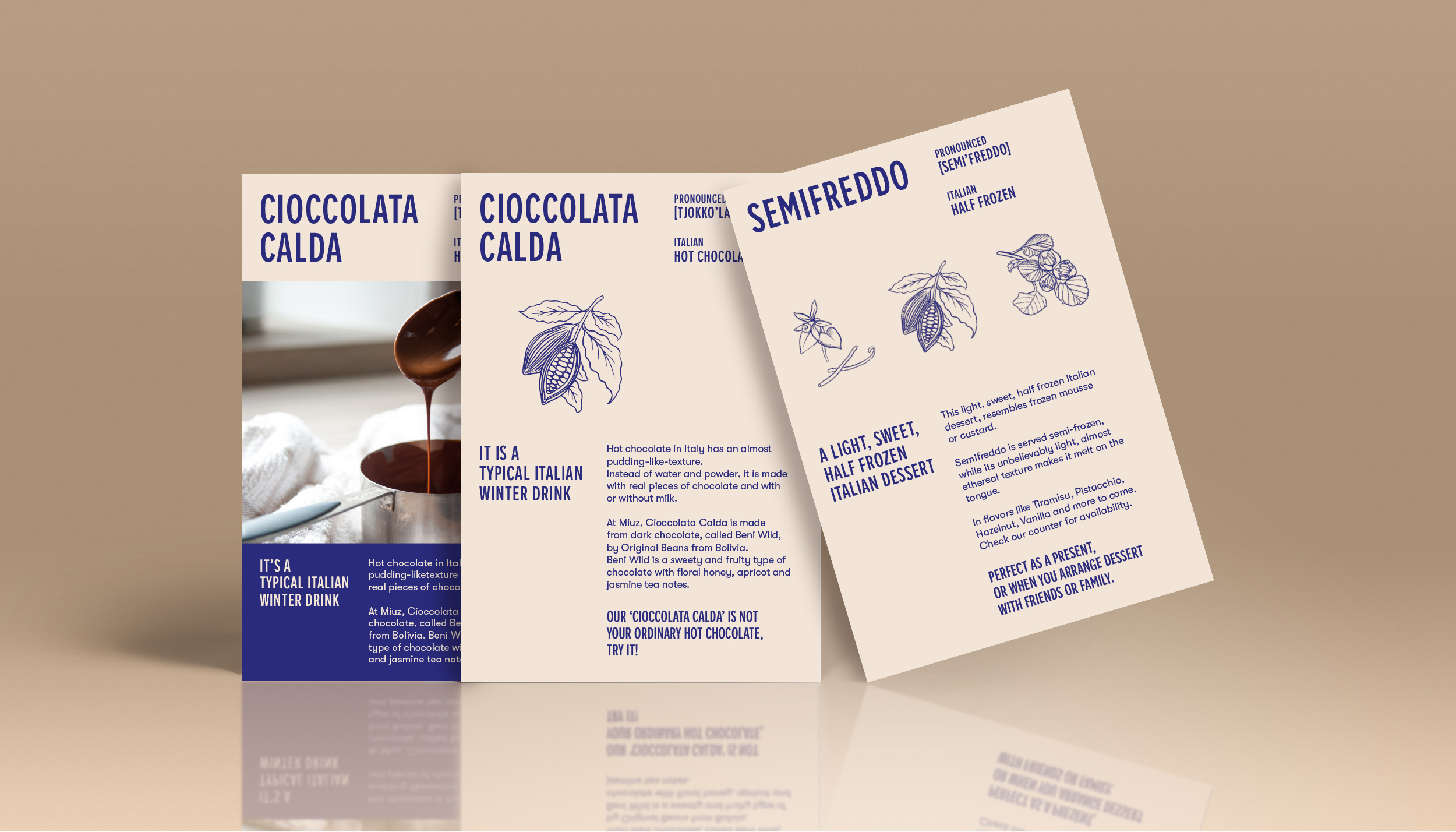
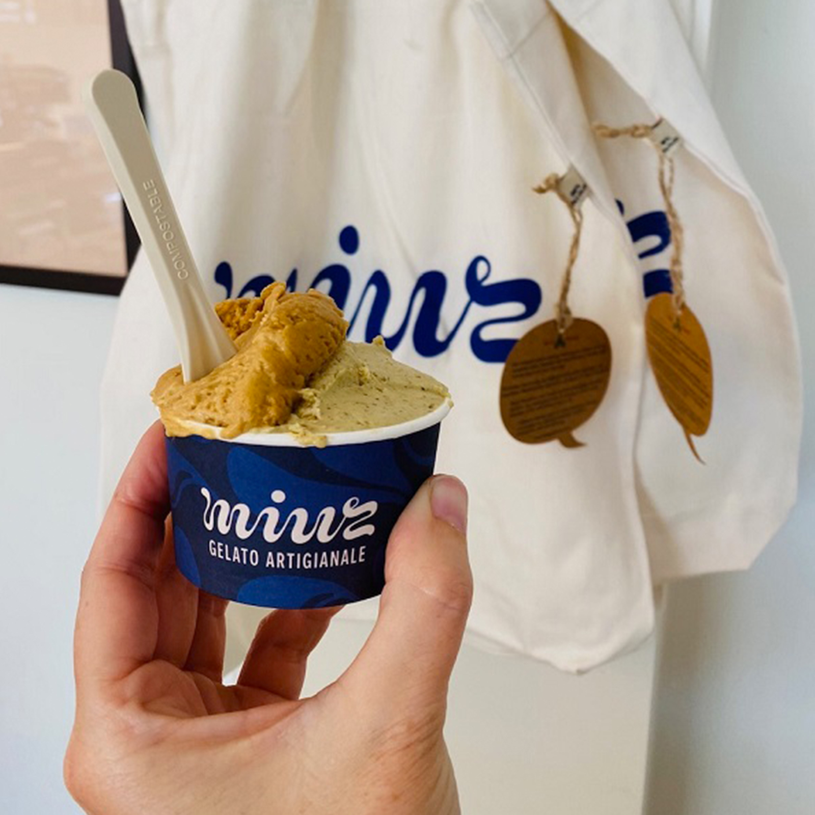
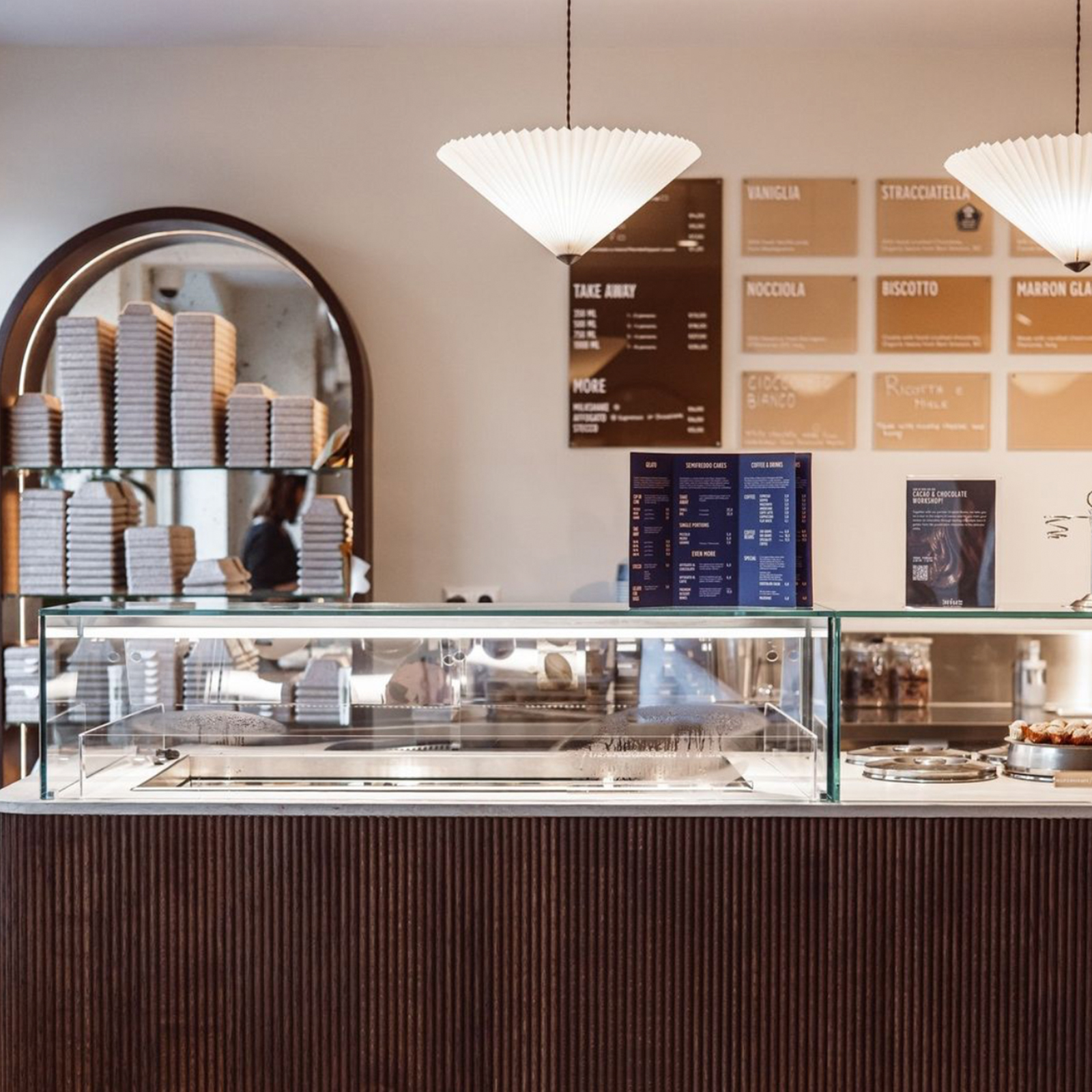
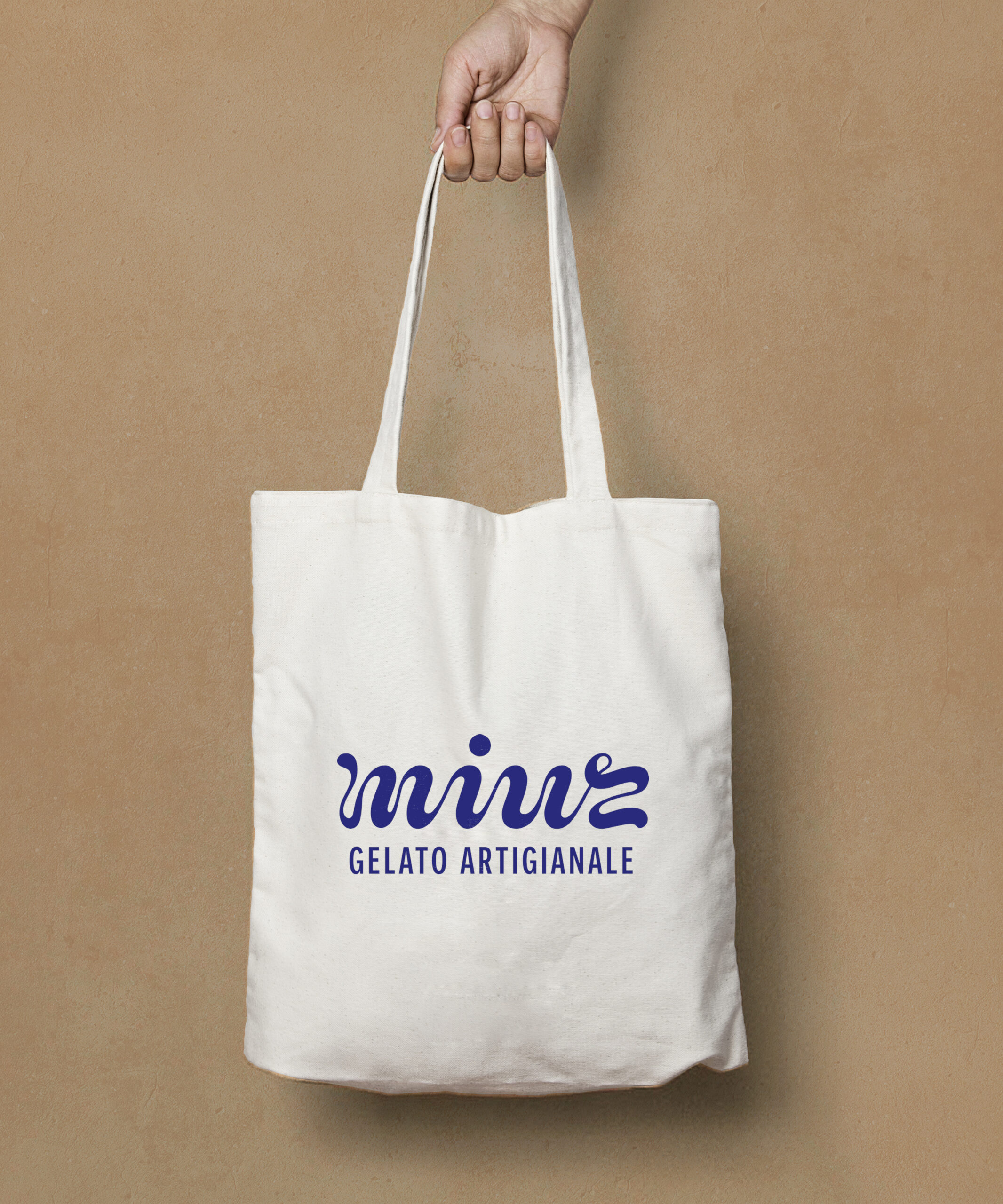
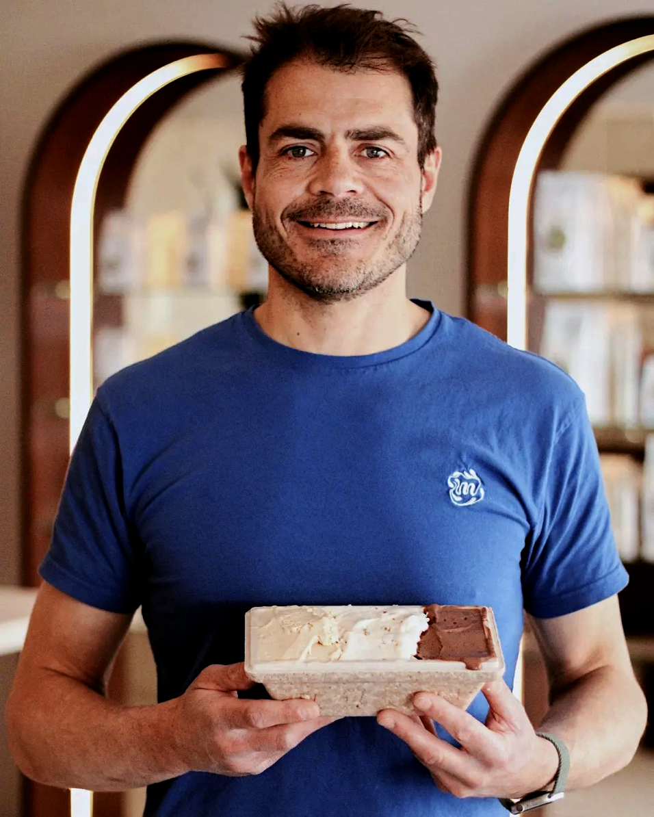
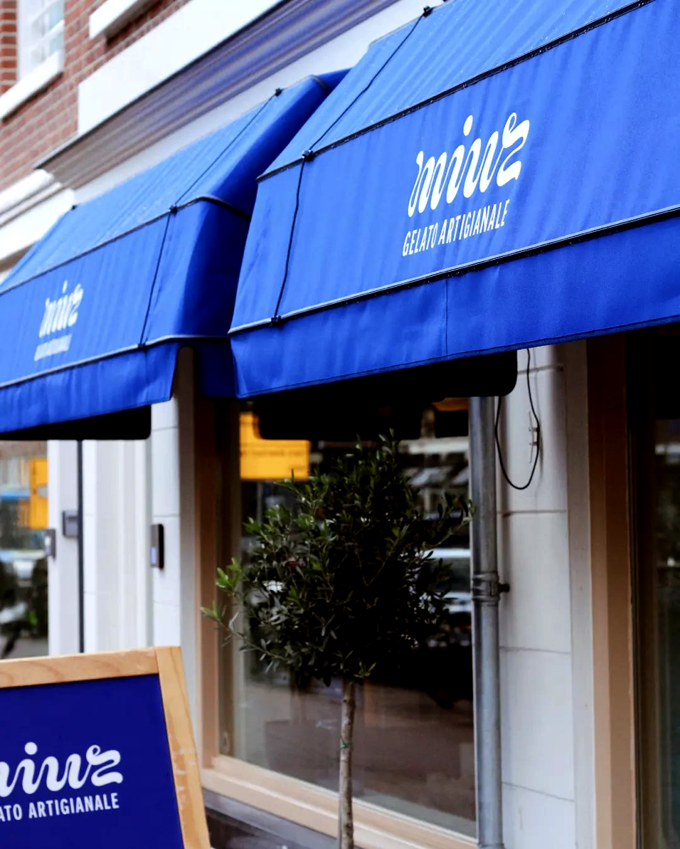
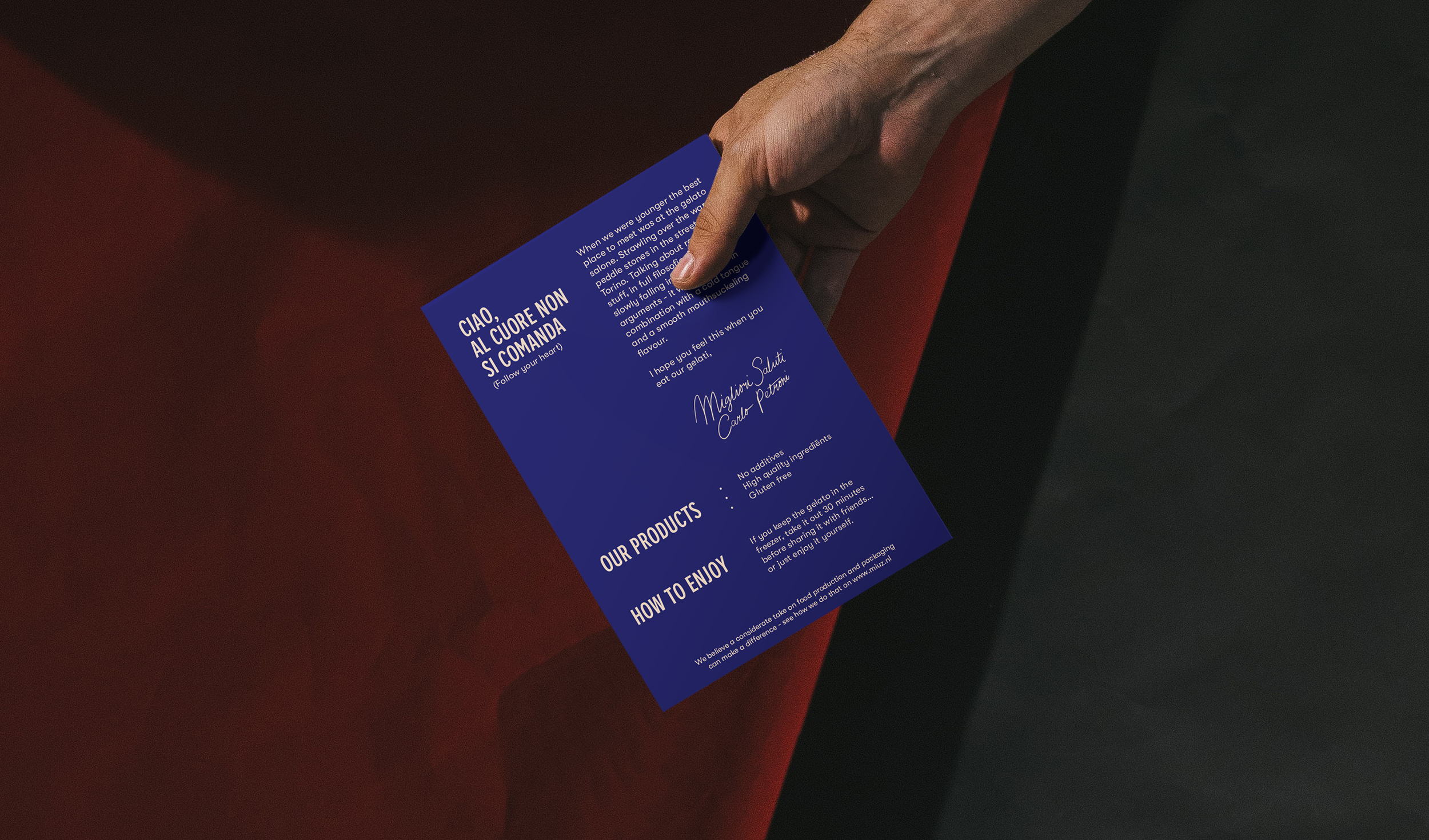
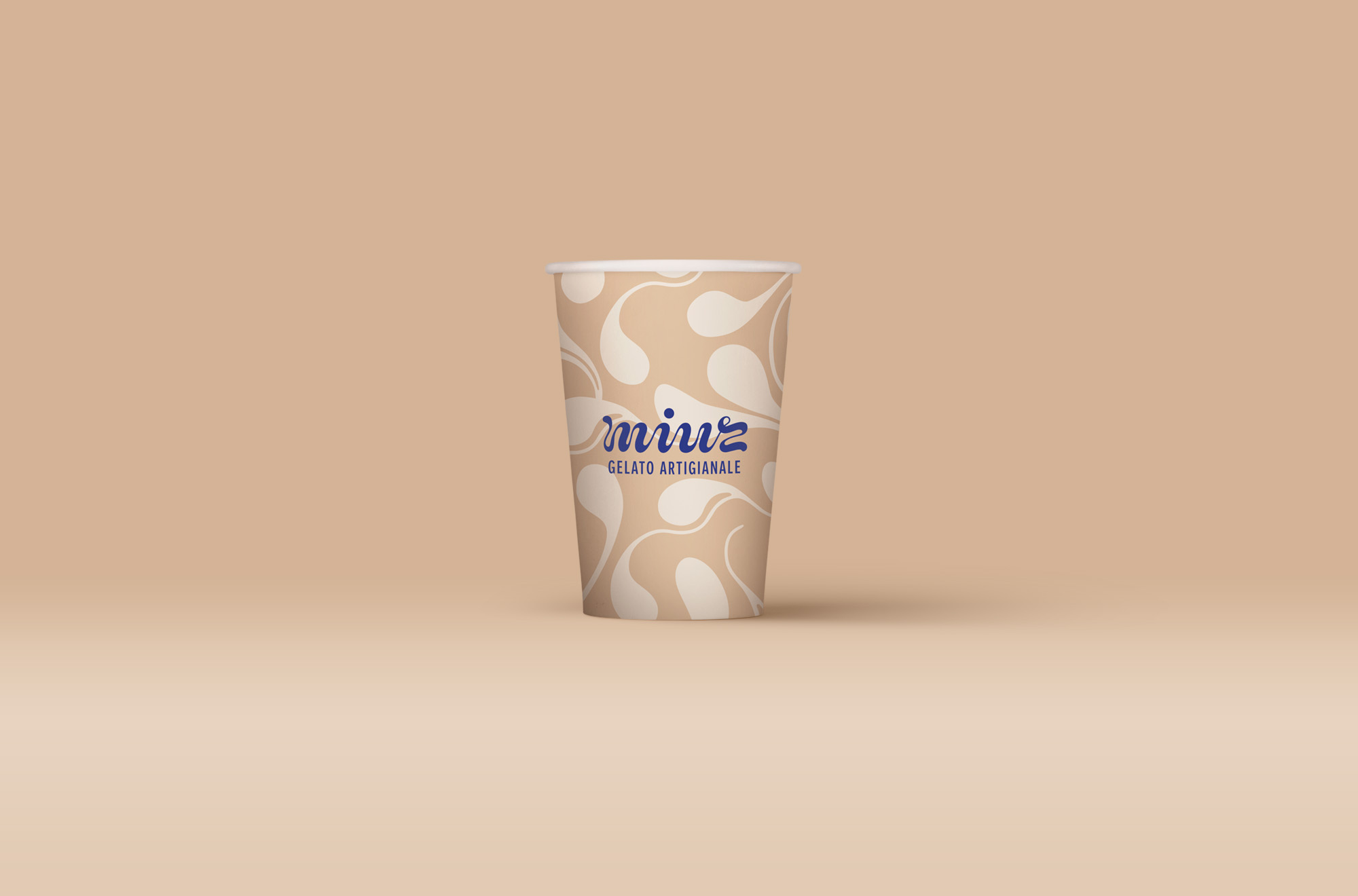
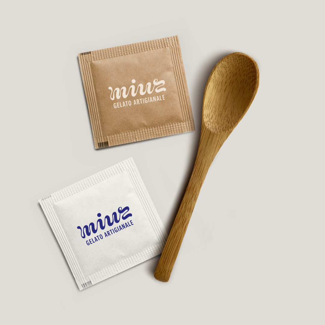
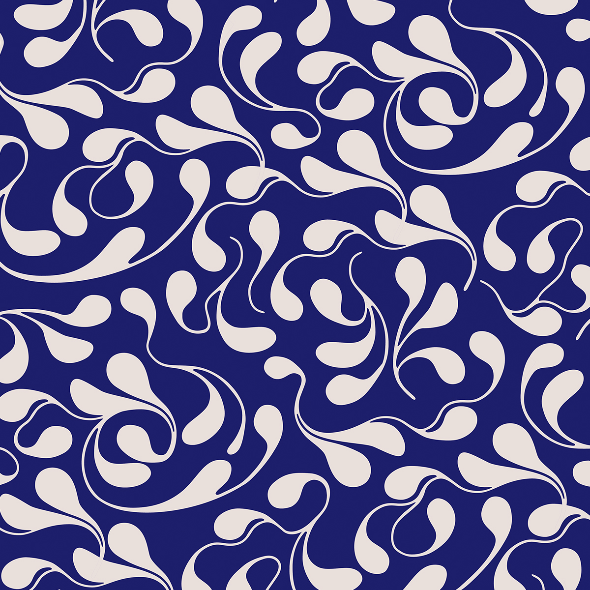
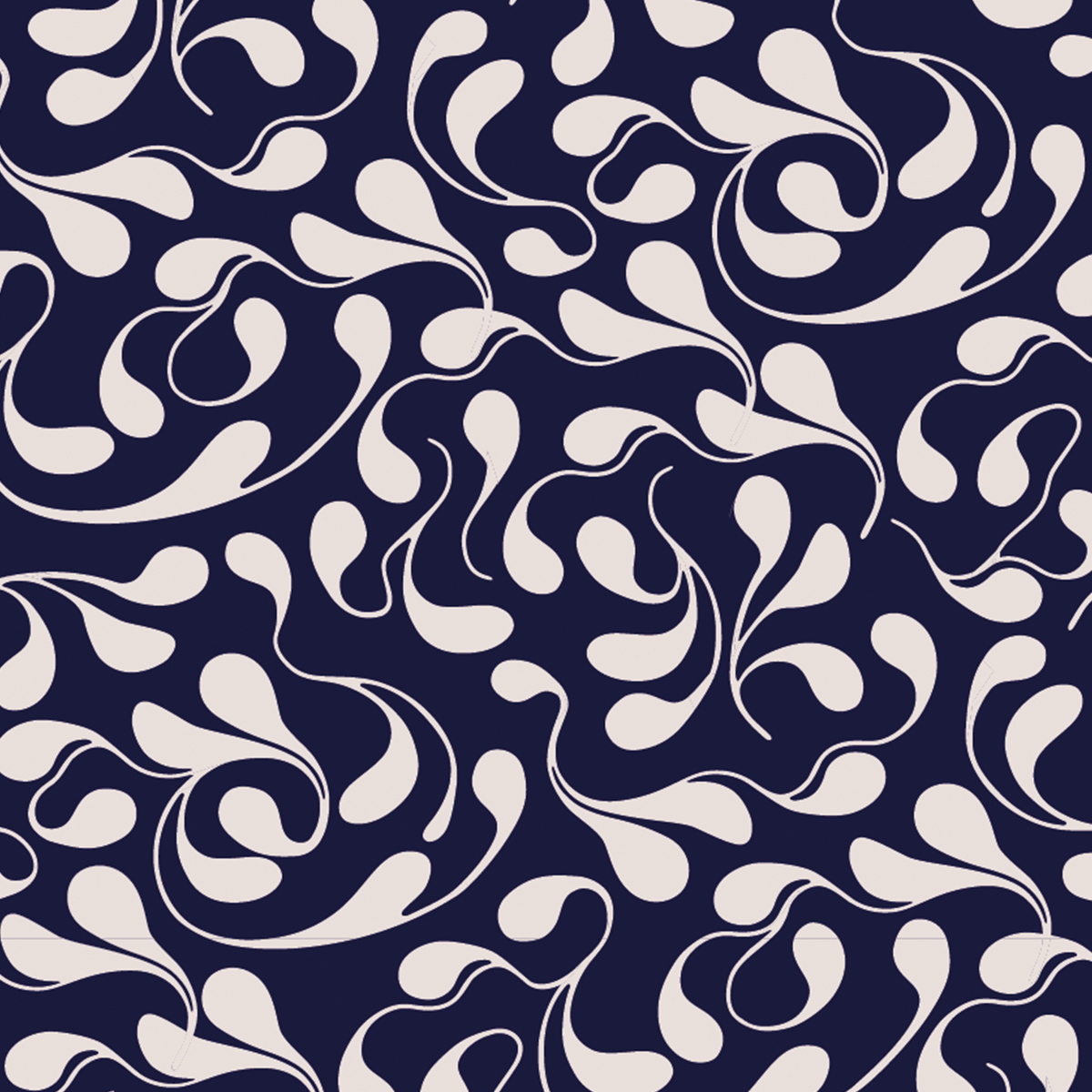
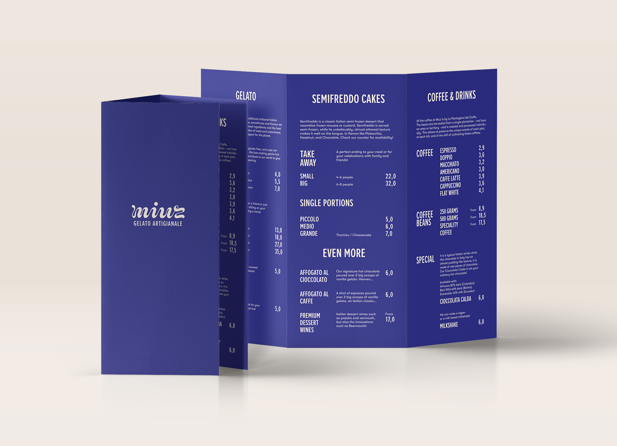
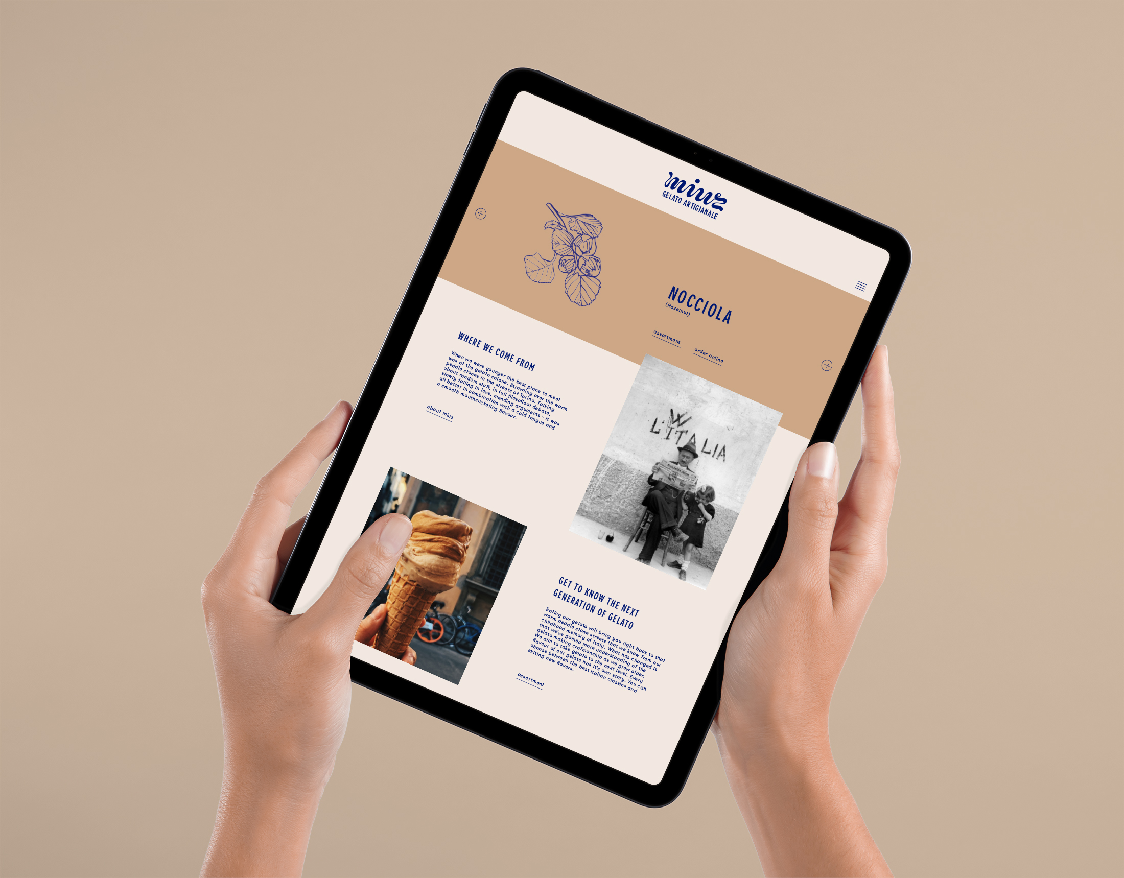
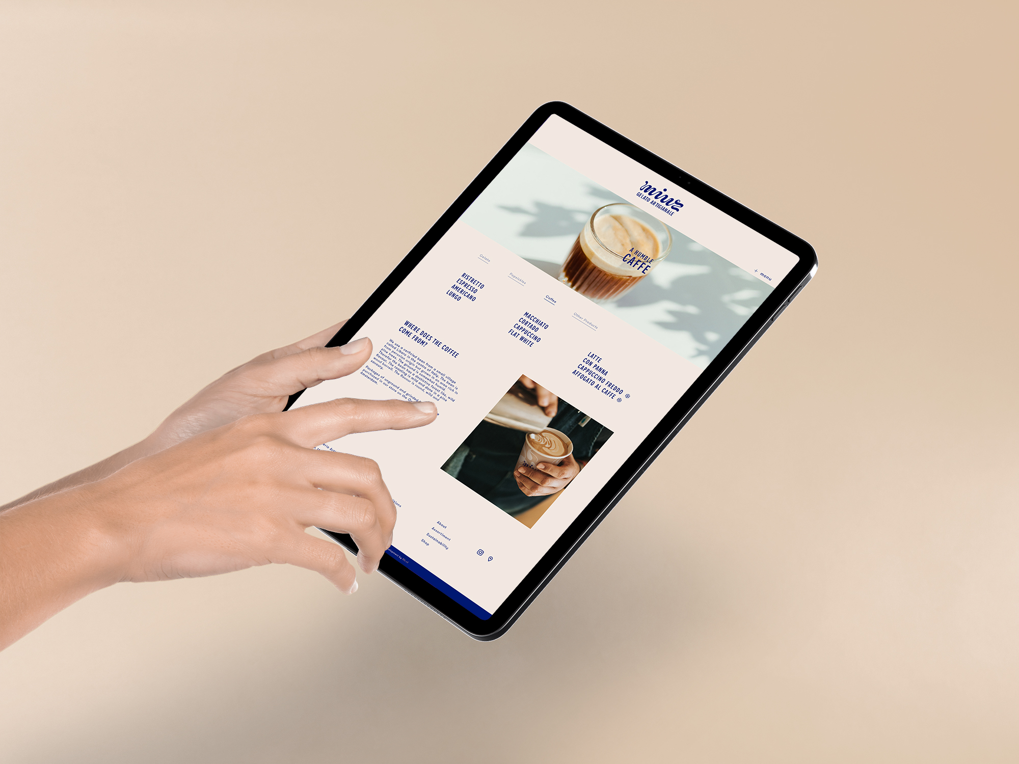
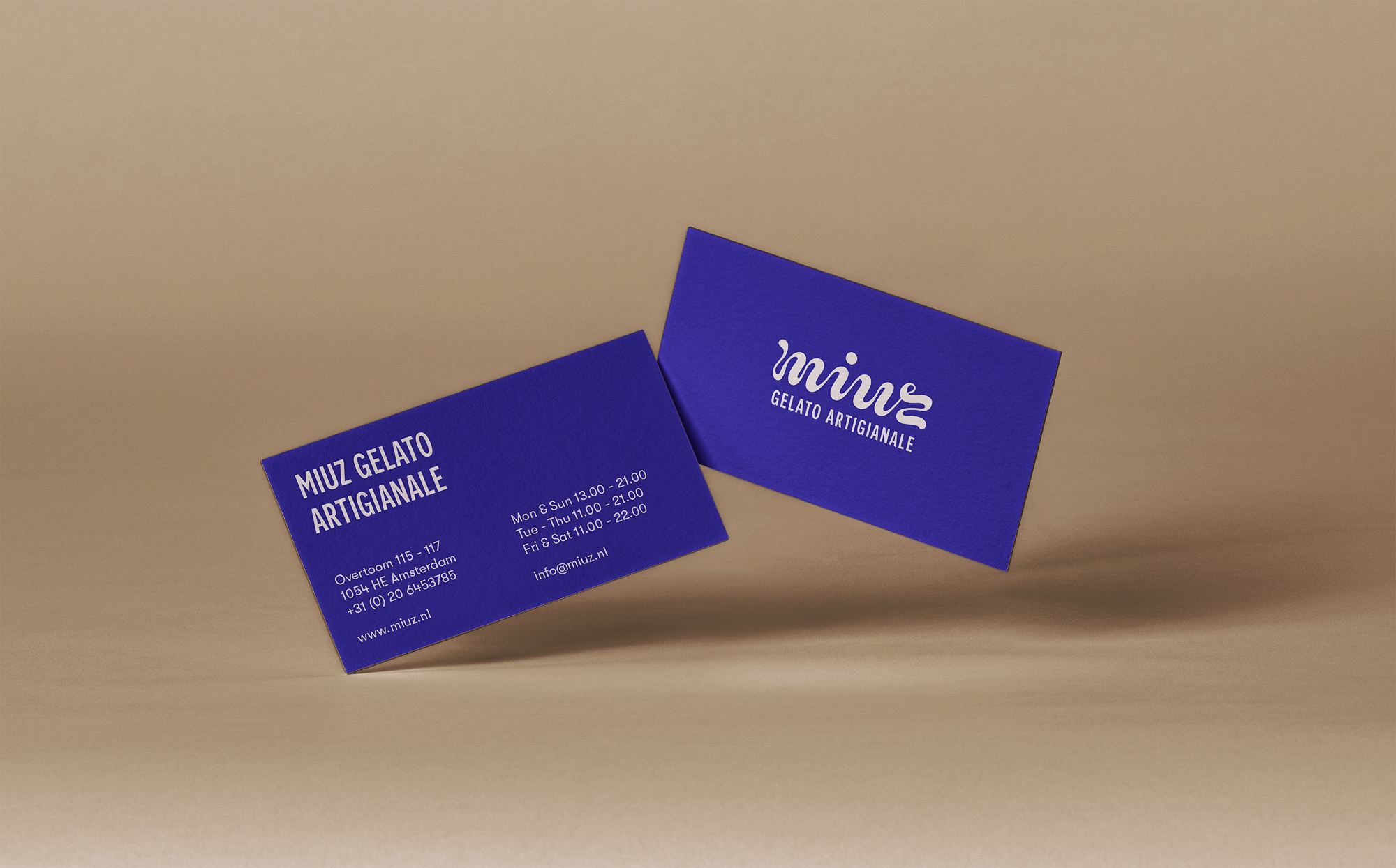
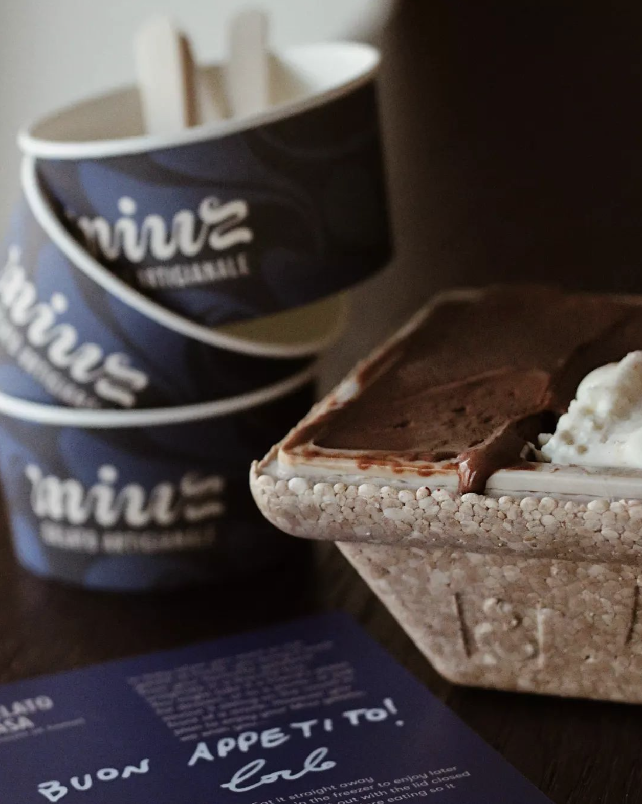
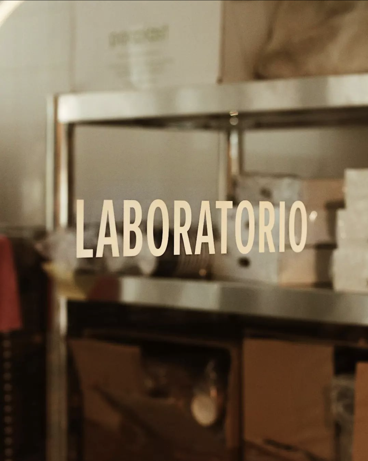
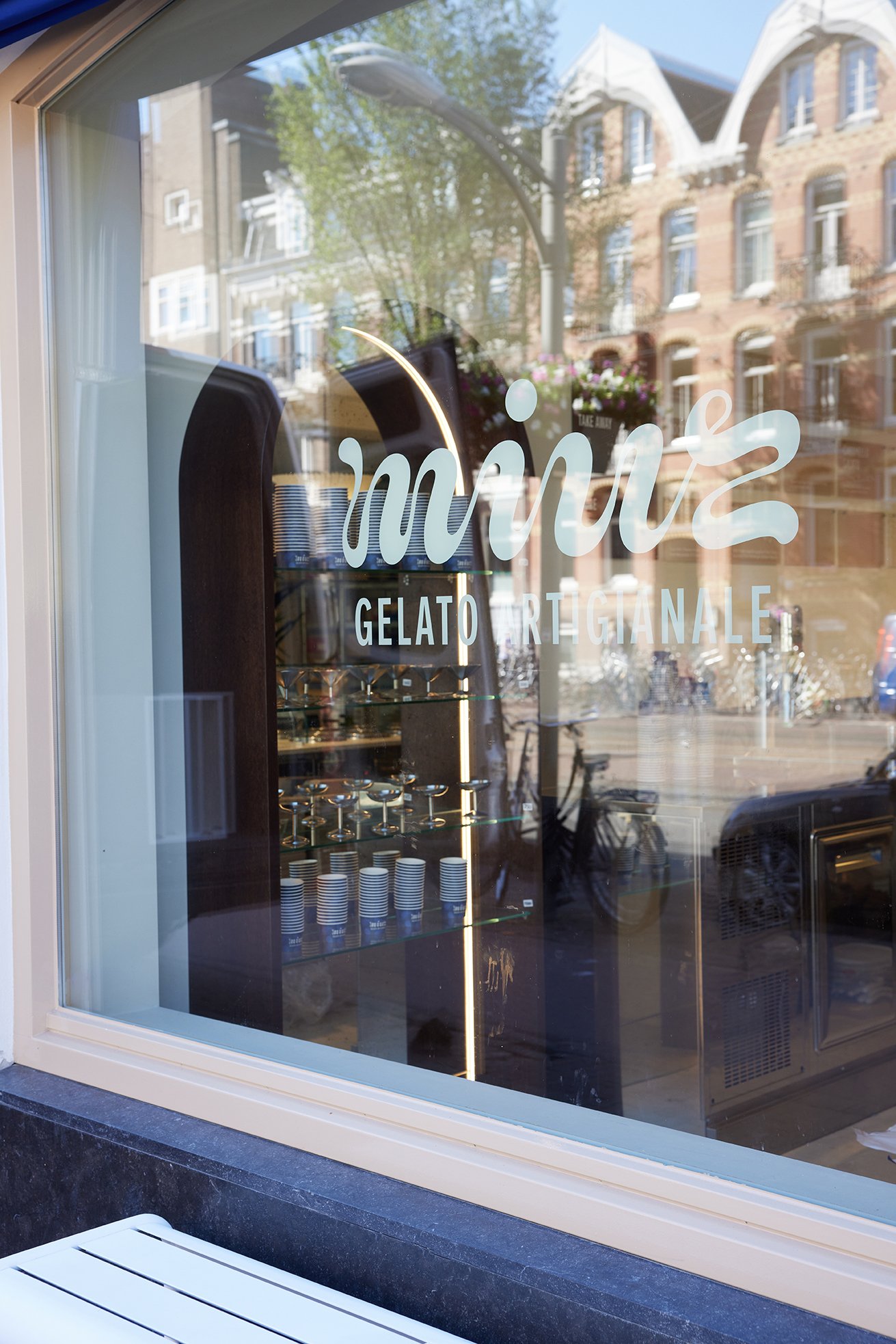
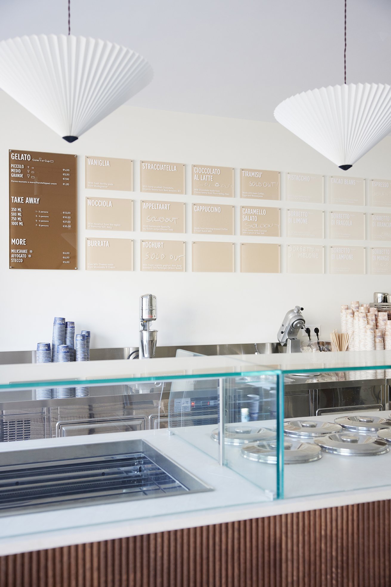
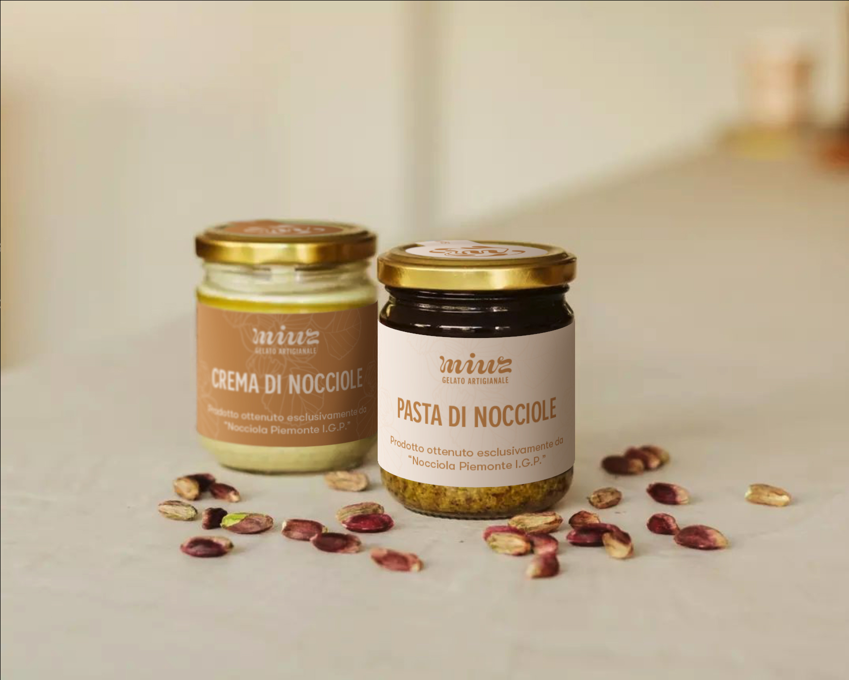
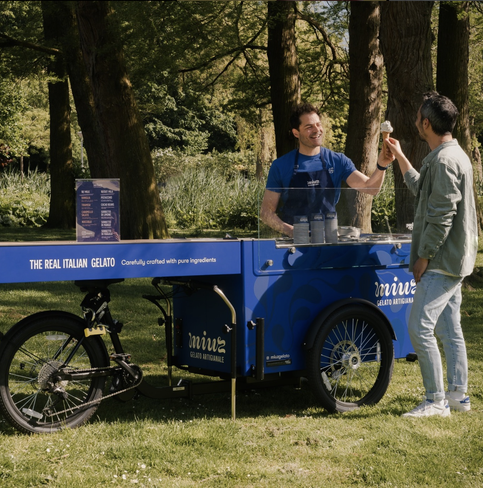
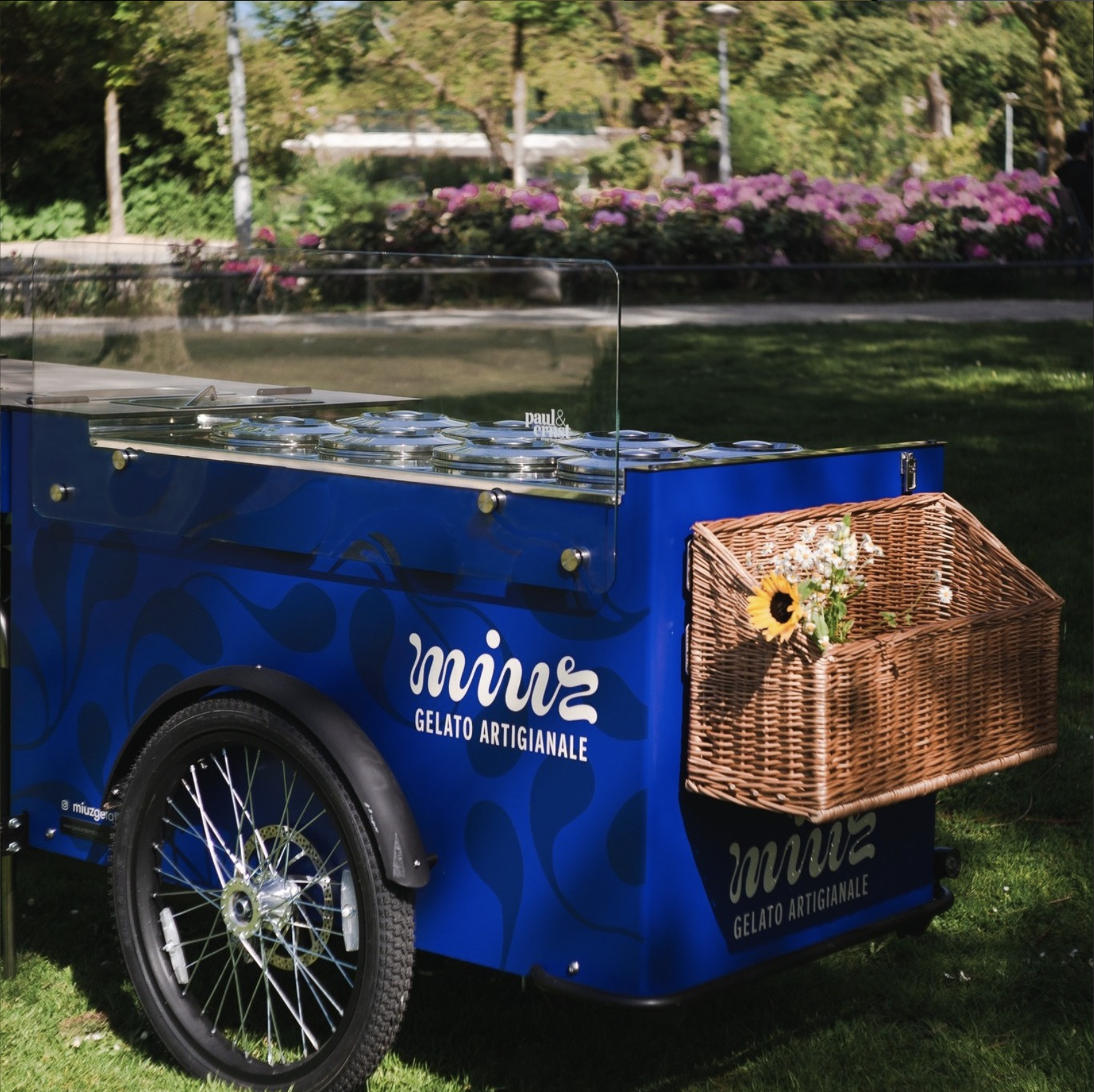
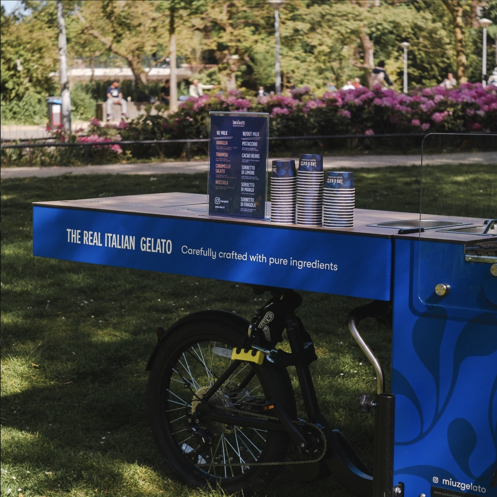
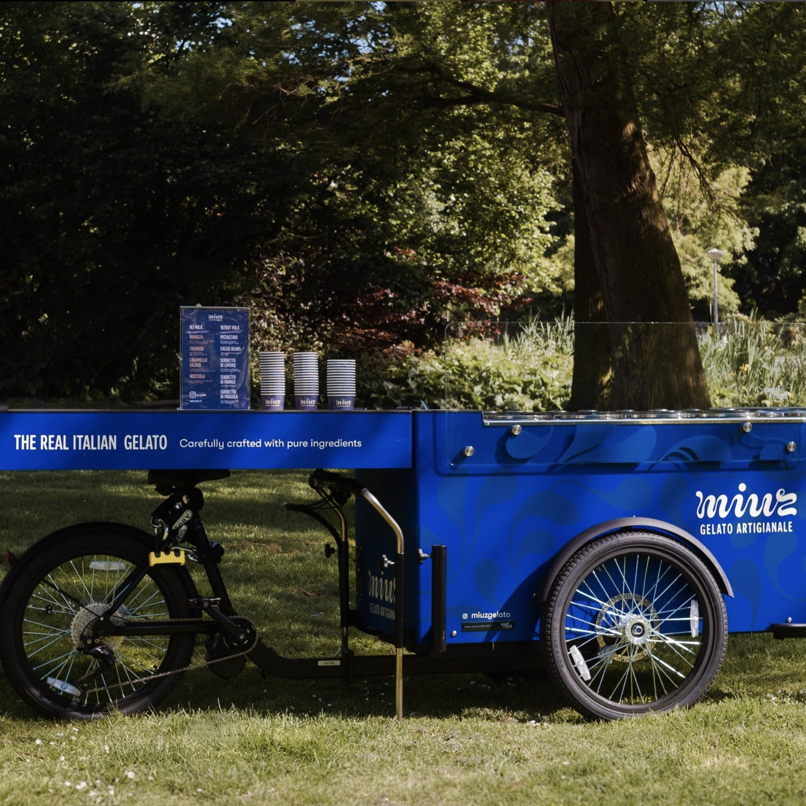
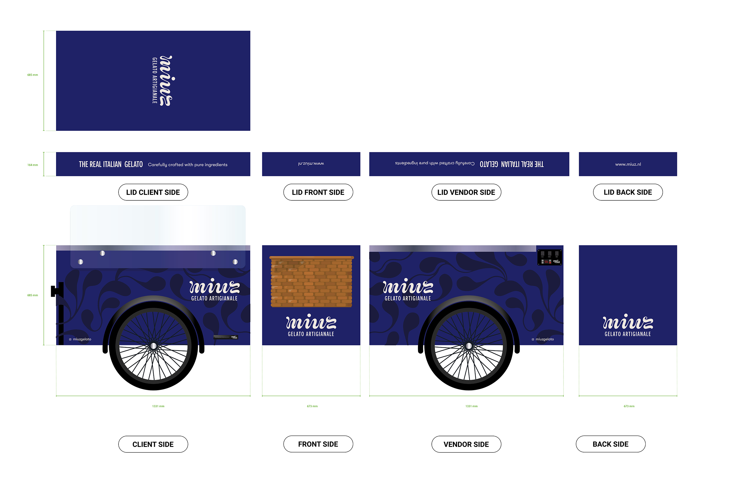
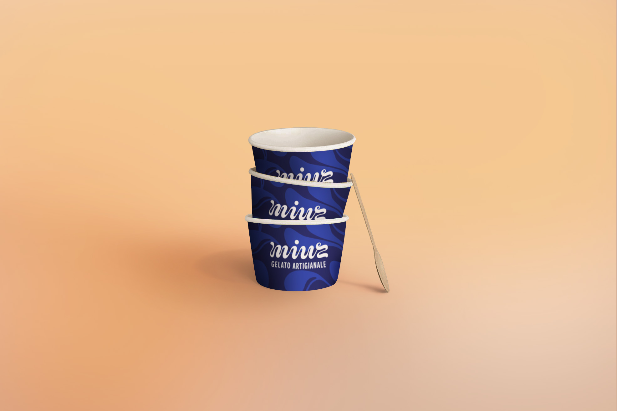
For Miuz Gelato Artigianale I have created an unique visual identity. The luscious movement of fresh gelato can be recognized in the letters of Miuz especially created for the brand. The identity colors are fresh, modern, but also reliable, conscious and humble at the same time. The photography aimed to be human and show craftsmanship. The luscious pattern and illustration style to support and expand the total identity.

To enhance the uniqueness and the recognizability of the Miuz brand, I created a custom illustration style and all-over pattern. The illustrations are used for the website, flyers, posters and other printed material that wants to communicate something about the ingredients. The all over print is used in all the color combinations for packaging, interior and in product design.

Although the webdesign has been altered by the client and third parties, please take a look at the website www.miuz.nl to see some of the base of the website designed by Studio Elisabeth Enthoven and developed by Filt.nl

The identity for Miuz has been expanded to multiple means of transportation like their Gelato cargo bike and multiple cars. In combination with the identity pattern such as great way to enhance the complete brand recognition.