Project
Nail MycosisClient
Imperial FeetType
Packaging DesignAssignment: Think of a packaging concept that uplifts the Imperial Feet brand, without drifting too far away from the existing identity, as the products will stay the same – only the packaging will be added.
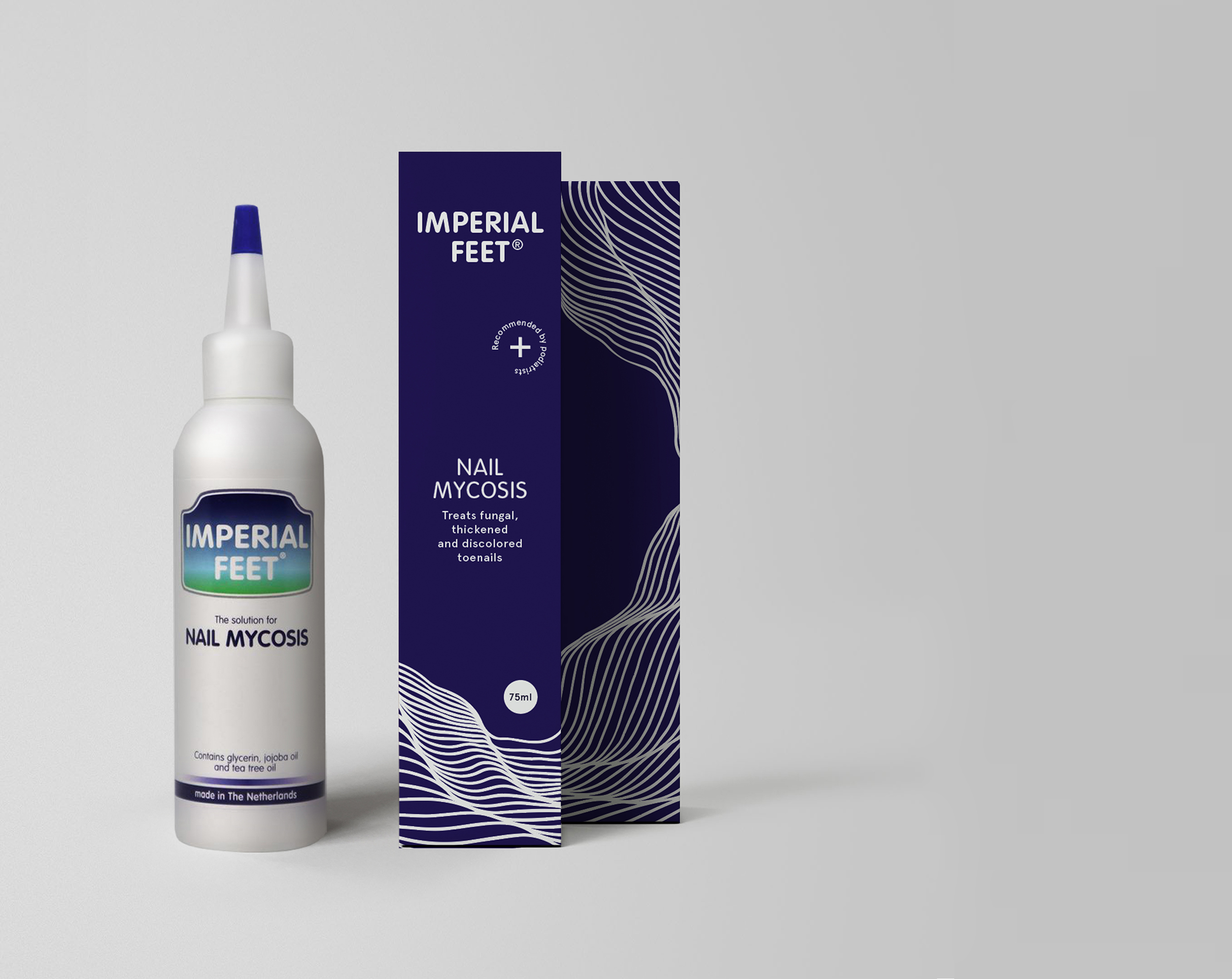
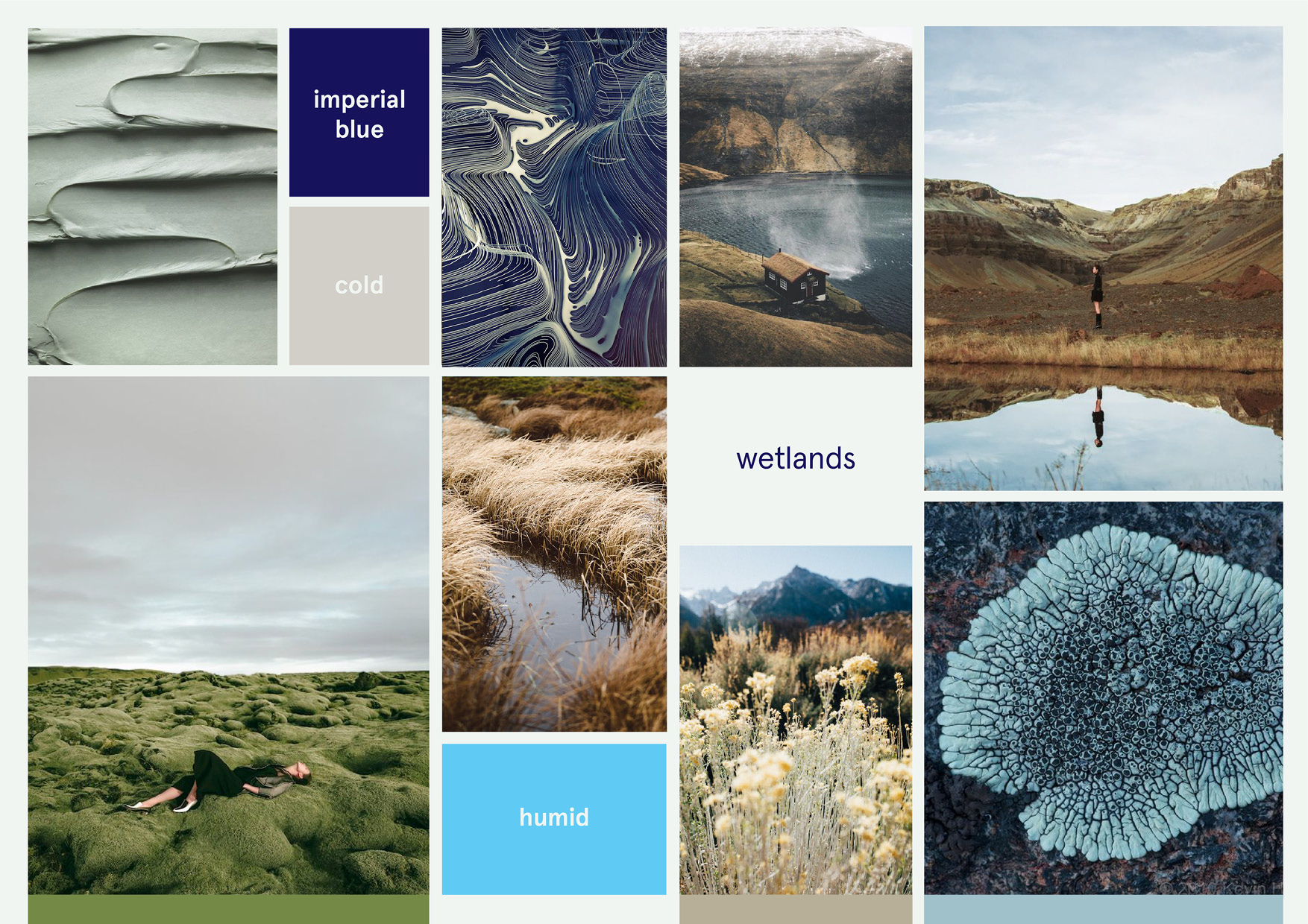
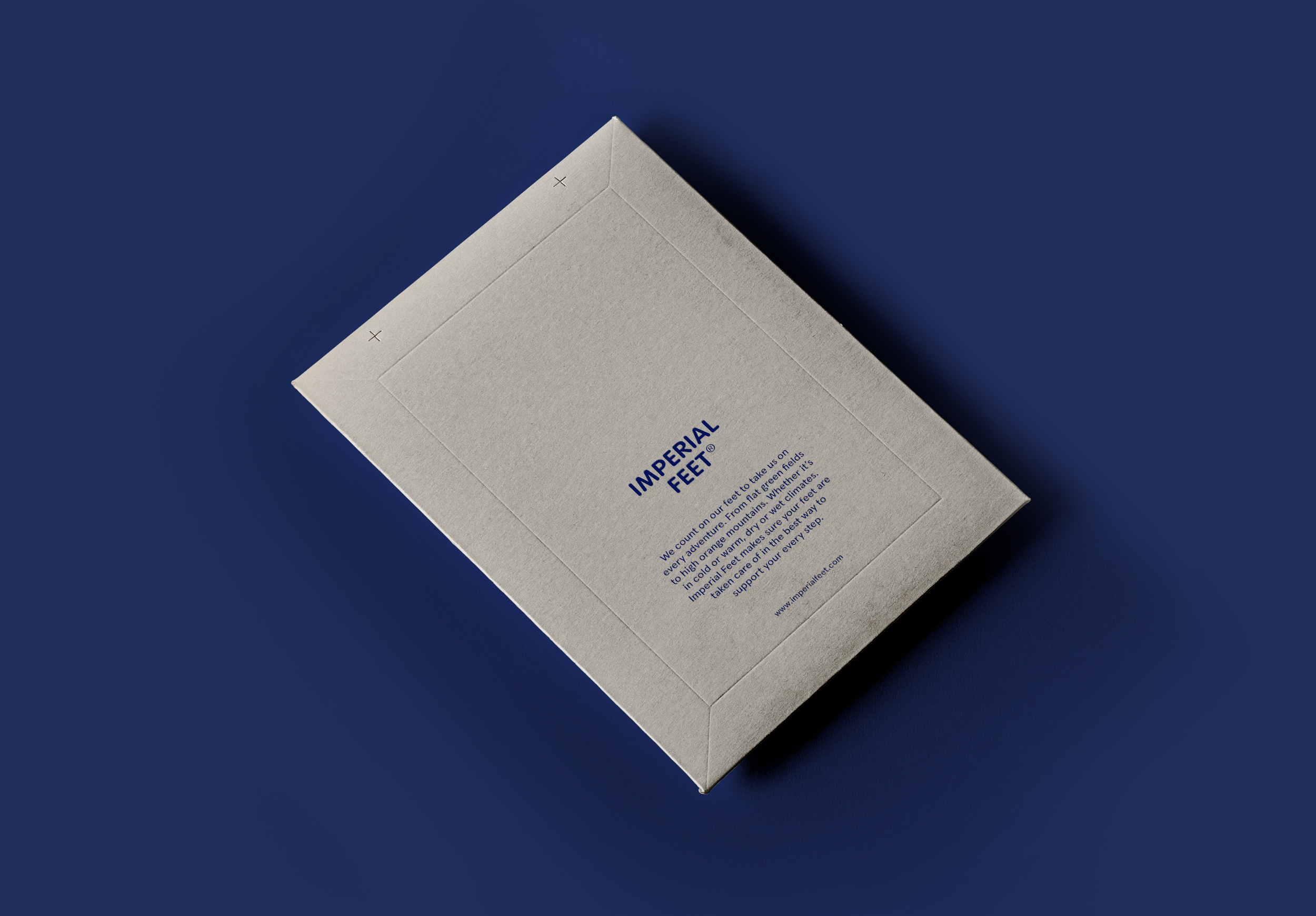
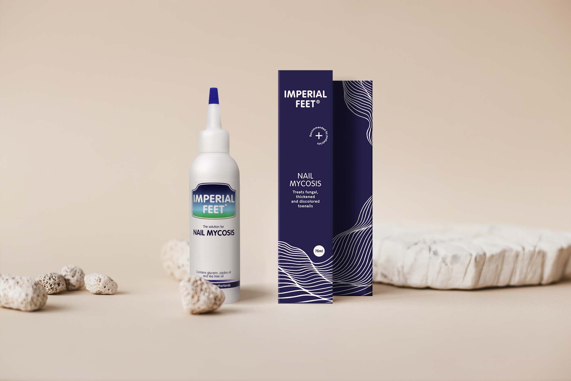
To think of a new visual identity or to refresh an existing identity I start by getting to know the brand, their core and their vision. In a brainstorm session we define key words, that are a guideline for any decision we make for the brand. It defines the brand character. To think of a general packaging concept I thought of a design system that can be applied to all products and their packaging. Also I updated the logo in a simple way by taking away the coloured badge that you still see on the product. The original badge contains some kind of landscape, this concept I used to define the packaging concept. It is based on different landscapes and climates that affect the health of the feet. For this bestselling product Nail Mycosis the landscape linked to the product is wet and humid. That is why we see the water like organic waves on the product. In the above picture we see the product presented next to dry stones but it should have a more humid and wet set design.
Photo by Nora Topicals on Unsplash